Light v0aCurrent
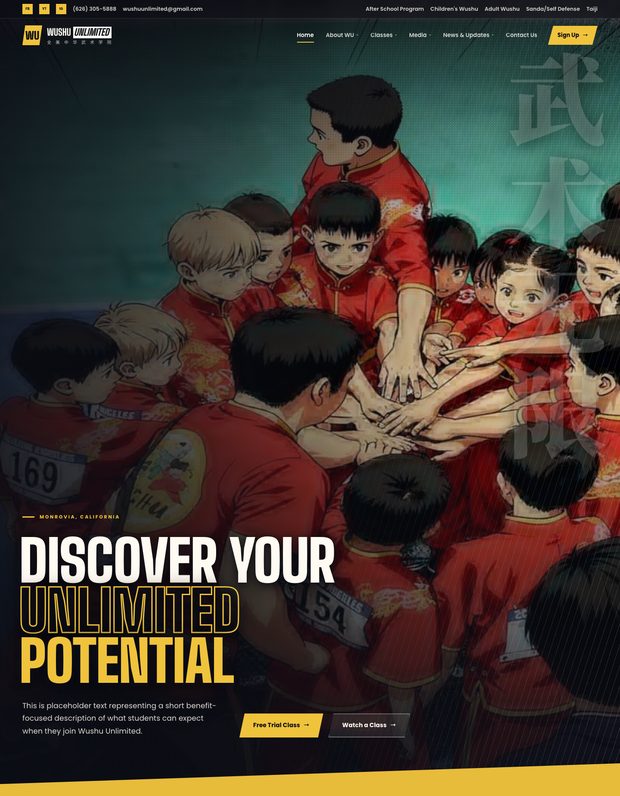
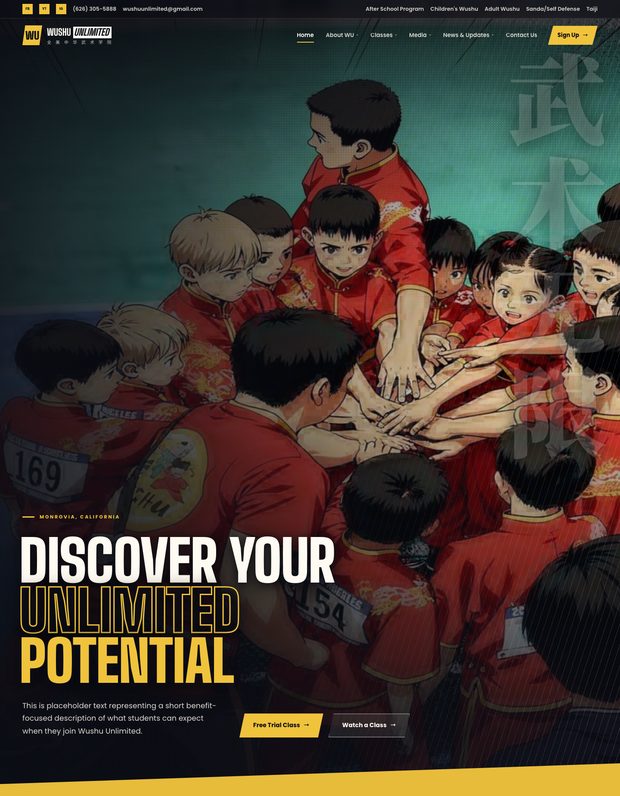
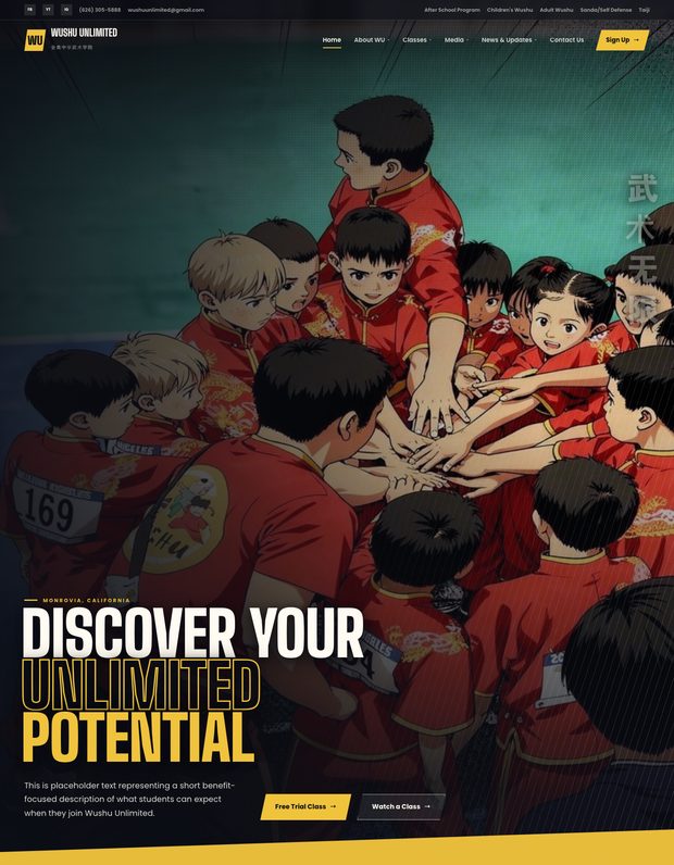
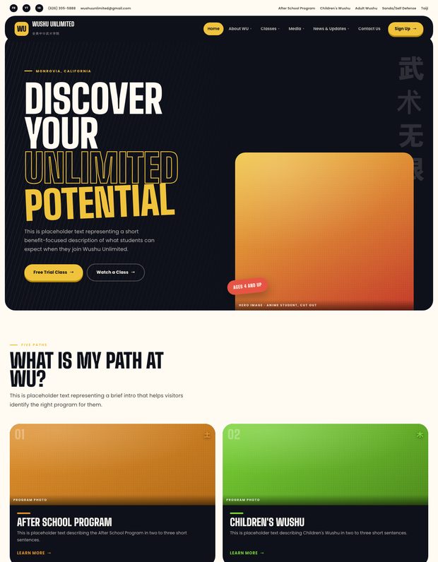
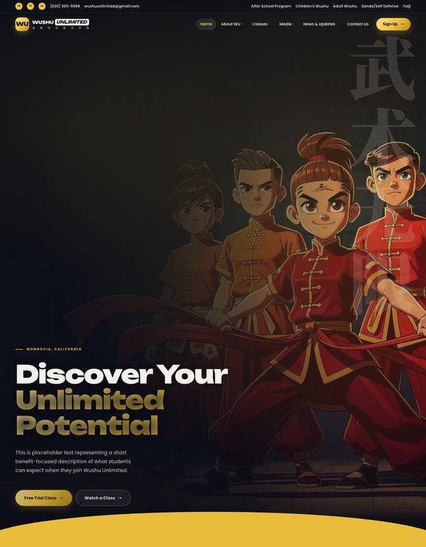
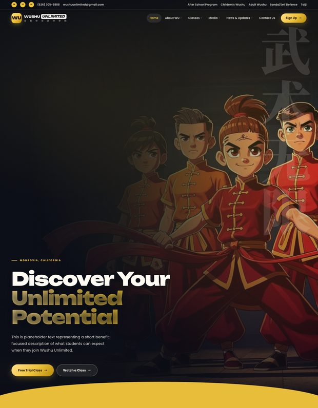
Paper ground. Closest of the three to a manga page printed on stock, which suits the flat cel artwork.
shonen-light-v0aOpen →

Every direction explored for the homepage. 少年 Shōnen is the one you selected, so it sits first, and the rest are kept underneath for reference. Each version of a direction has its own row, newest first.
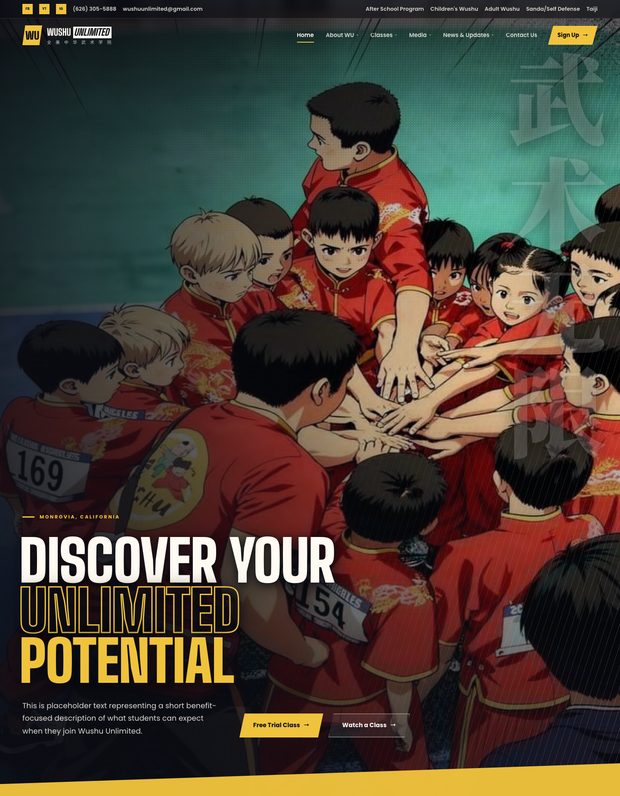
The Japanese shōnen manga and anime lane, carrying a Chinese motif rather than a Japanese one. Hard angular cuts, halftone screentone, speed lines and condensed type in Big Shoulders. Full-bleed key art with the five paths as expanding vertical panels. Artwork is drawn from the school's own photography, so the people, uniforms and gear are the real ones.
Paper ground. Closest of the three to a manga page printed on stock, which suits the flat cel artwork.
Program cards rebuilt from the school's photographs as 2D anime cel, replacing the generated scenes.
Where the revision rounds landed: the marquee loop fix, the full-height Chinese watermark, the real wordmark with UNLIMITED knocked out, and the program color swap.
Earlier panel treatment before the expanding accordion rail.
First cut of the anime lane.
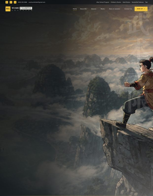
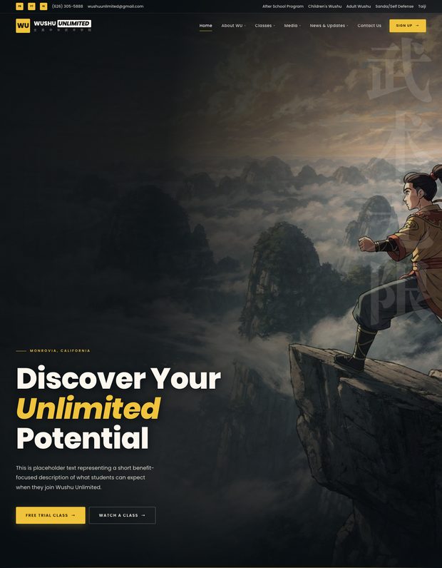
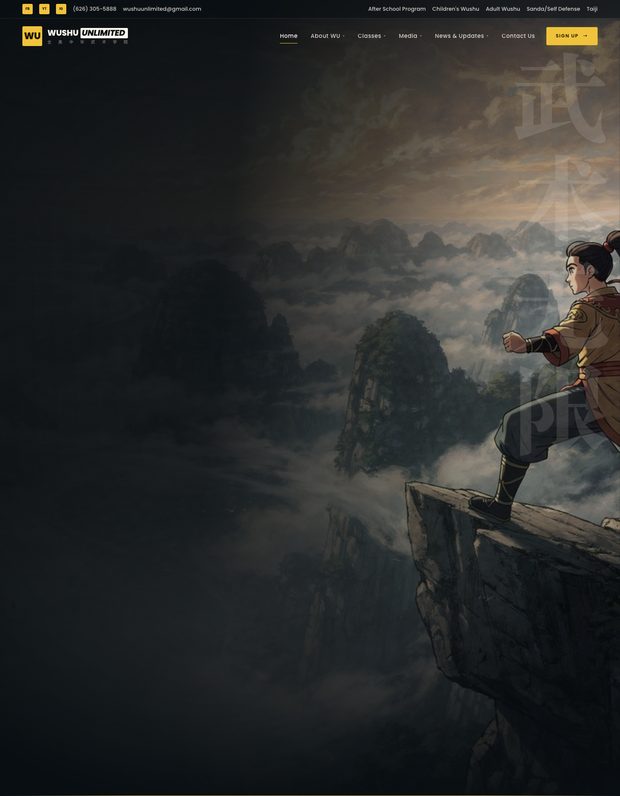
Mountains and rivers. Roughly 70% modern Chinese animated blockbuster, 20% classical shanshui ink-wash, 10% Japanese painterly. High-contrast Bodoni display, hairline gold rules, atmosphere carrying the weight rather than gloss. The hero and seasonal band are set in the karst peaks and cloud sea of Yunnan.
Warm paper ground. The direction that gains most from it, since shanshui is ink on paper to begin with. Marquee and promo bands drop to paper with hairline rules.
Program cards rebuilt from the school's own photographs, restyled rather than invented. Same people, poses, uniforms and footwear.
First cut. All five program panels were mountain scenes, which put the same scenery in every frame.
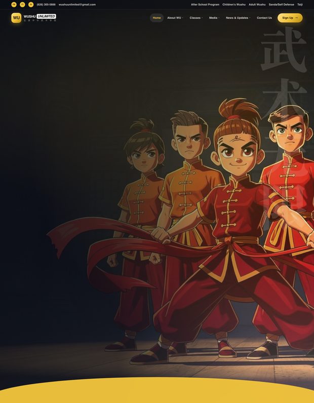
Splendour. The modern animated feature lane: cel-shaded CG with hard-edged posterized shading, anime faces on stylized 3D bodies, heavy rim light and glossy speculars. Soft rounded geometry, pill buttons, a gold gradient headline and a curved sweep where Shōnen has a hard diagonal. Unbounded for display.
Warm off-white paper, deep ink type. Gold kept as a fill on buttons and the marquee band, since it fails as text on paper.
Program cards rebuilt from the school's photographs. Real coaches, students and gear in the animated-feature look.
First cut, before the artwork was rebuilt from the school's photographs. Repainted onto the approved palette.
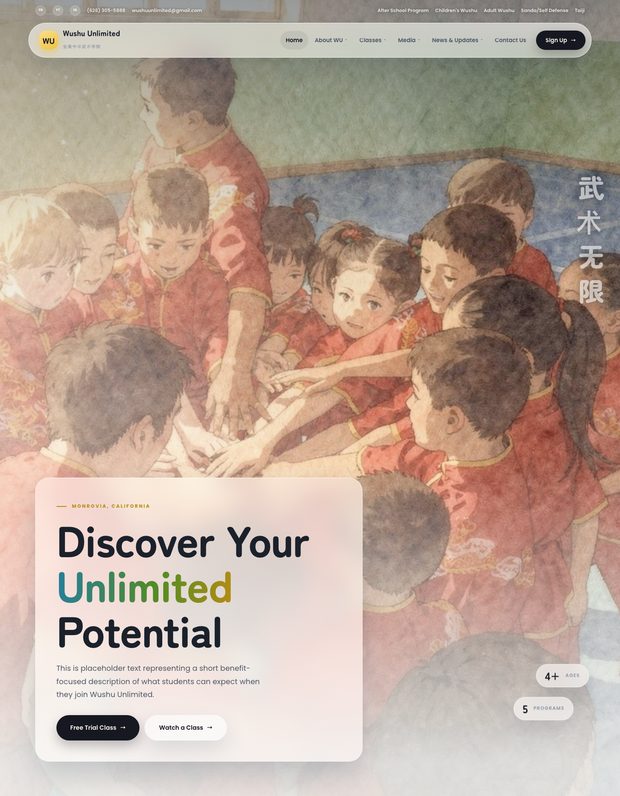
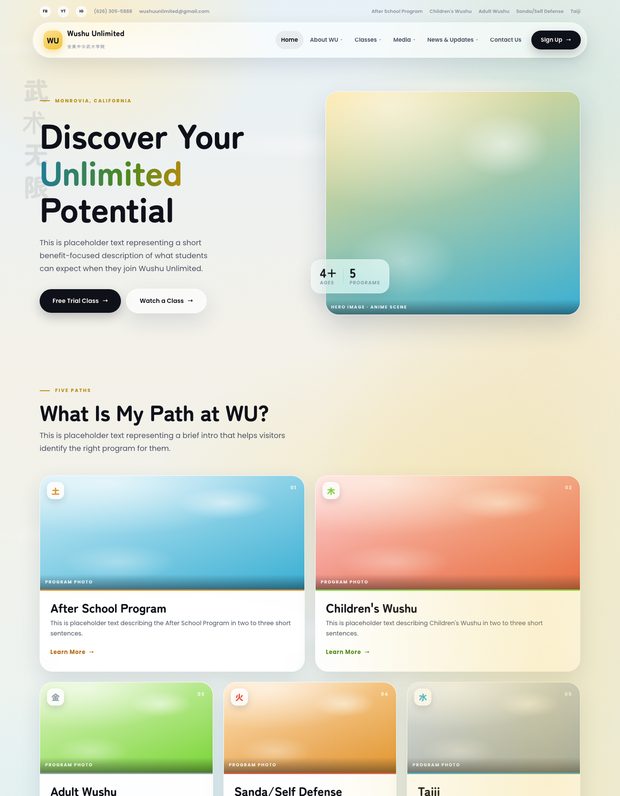
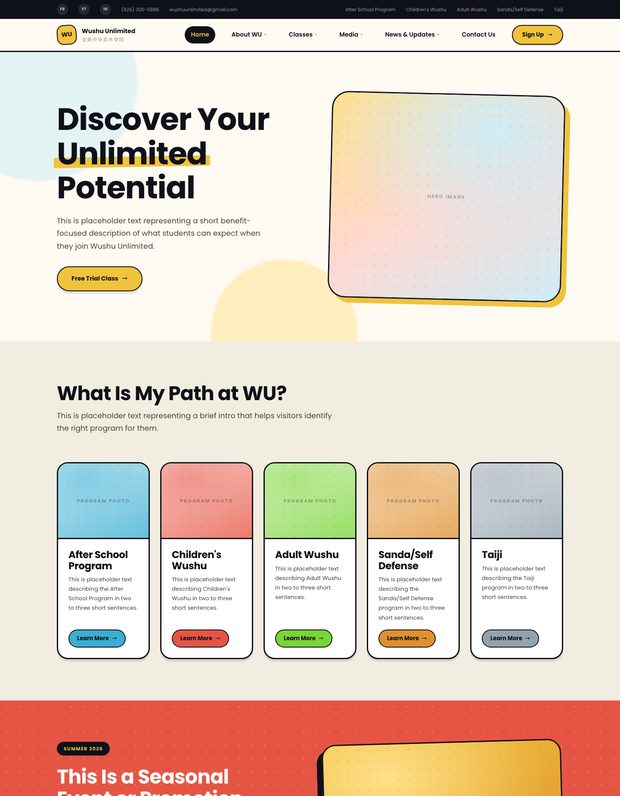
The softer anime lane, rounded Zen Maru Gothic and lighter air. Parked once the manga direction was preferred, so its artwork was never rebuilt from the school's photographs the way the later directions were.
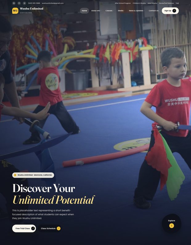
The professional, parent-facing lane, and the only one with no anime in it. Real photography from the May shoot, warm paper ground, serif display mixing roman and italic, the five paths as an uneven mosaic. Parked, but it is the natural thing to show beside whichever animated direction wins.
Hover a mosaic tile and the photo zooms, the tile lifts, and its description and button open.
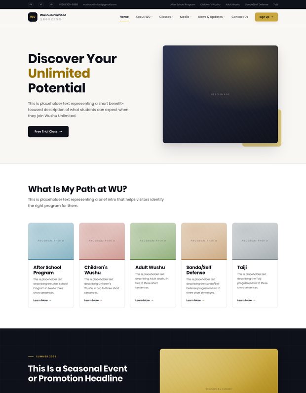
The original three directions, before the pivot to an anime lane. Kept so the range that was considered stays visible.